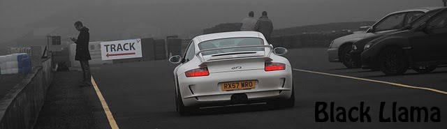
Better late than never, but here are some designs i've come up with for my poster. Ones a Duotone which i quite like, then theres the classic multi box version and a split image version too. Anyone care to say which they like?
Looking good. I quite like the first one becasue the sepia tone gives it an old ffeel and i think that relates to your work. But I like the last one - the red just brightens it up a litle bit. :)
Im thinking either the 3rd or last one..Like Laura said, the sepia does relate to your images but I think your best bet would be to stick with the original black and white. Would be good to see you play around with the colours for poster 4, instead of red :)
I prefer number 4 - I think the colours are good & it grabs the attention. Not sure I'd have quite so many images given their similarity. Maybe you could re-edit the choice of images or add more colour blocks to break it up a bit?


Looking good. I quite like the first one becasue the sepia tone gives it an old ffeel and i think that relates to your work. But I like the last one - the red just brightens it up a litle bit. :)
ReplyDeleteIm thinking either the 3rd or last one..Like Laura said, the sepia does relate to your images but I think your best bet would be to stick with the original black and white. Would be good to see you play around with the colours for poster 4, instead of red :)
ReplyDeleteI prefer number 4 - I think the colours are good & it grabs the attention. Not sure I'd have quite so many images given their similarity. Maybe you could re-edit the choice of images or add more colour blocks to break it up a bit?
ReplyDeletethanks for the input, i'll have a little play and see what i come up with :)
ReplyDeleteTop one is very very good. I like it a lot
ReplyDelete