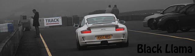
once again these aren't final versions, so no criticising any bad cutting out.
I have stayed with the idea of a word to anchor the image, and i think it just about works, though do tell me if you dont like them.
I've been trying to play around with the locations a bit more to attempt some interesting shots, so without further ado,


I like the second one but that may be cos it's a bit messy and the colours are fuzzy - kind of anti car advertising?
ReplyDeleteoooooo i like the second one! very enigmatic :D x
ReplyDeleteThis may not help but i like both - the second one because of the colours and the first because of the composition - although maybe the text could be moved elsewhere.
ReplyDeleteliking both is not an issue as i was planning to use both anyway :)
ReplyDeletewas just seeing if people liked them i guess
i like these as they dont show all of the car, so make them interesting and different to other shots.
ReplyDeletei like